Important: This guide explains visual simulation. It does not diagnose a condition or recommend treatment.
Key takeaways
- A1 and B1 are labels in different hue families, not two steps on one universal whiteness scale.
- B1 often reads cleaner or brighter, while A1 often reads warmer—but either can look natural or artificial depending on the whole smile.
- B1 belongs to a conventional natural-tooth shade guide; it is not automatically the same as an extra-white bleaching or 'Hollywood' shade.
- Use a simulator to compare broad directions, then use physical samples, relevant materials and controlled lighting for an actual restoration.
The short answer: A1 is warmer; B1 often reads brighter
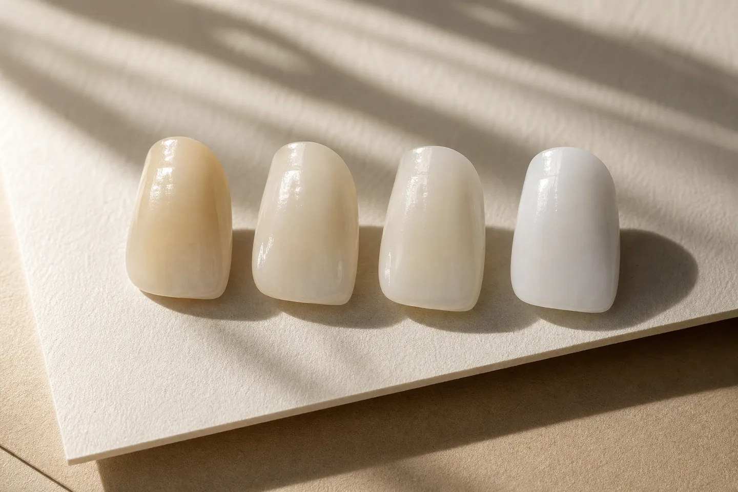
If you place A1 and B1 beside the same face, many people describe A1 as the warmer, softer direction and B1 as the cleaner or brighter direction. That makes A1 a common starting point for someone who wants an understated result, while B1 may suit someone who wants the smile to look noticeably lighter without immediately entering an ultra-bleached range.
That is a visual tendency, not a rule. B1 can look entirely natural in one smile and conspicuous in another. A1 can look harmonious beside untreated teeth, or too warm if the surrounding teeth and intended material are much lighter. Tooth shape, surface texture, translucency, lip colour, skin contrast and how many teeth are being restored all change the impression.
The useful question is therefore not simply 'Which code is more natural?' It is 'Which colour direction stays believable in my full face, beside the teeth that will remain untreated, and in the material my dentist plans to use?'
What do A1 and B1 actually mean?
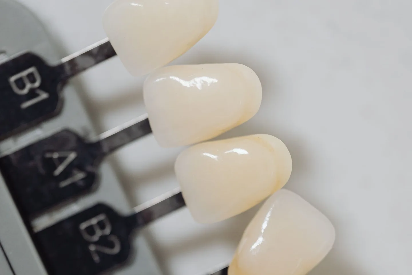
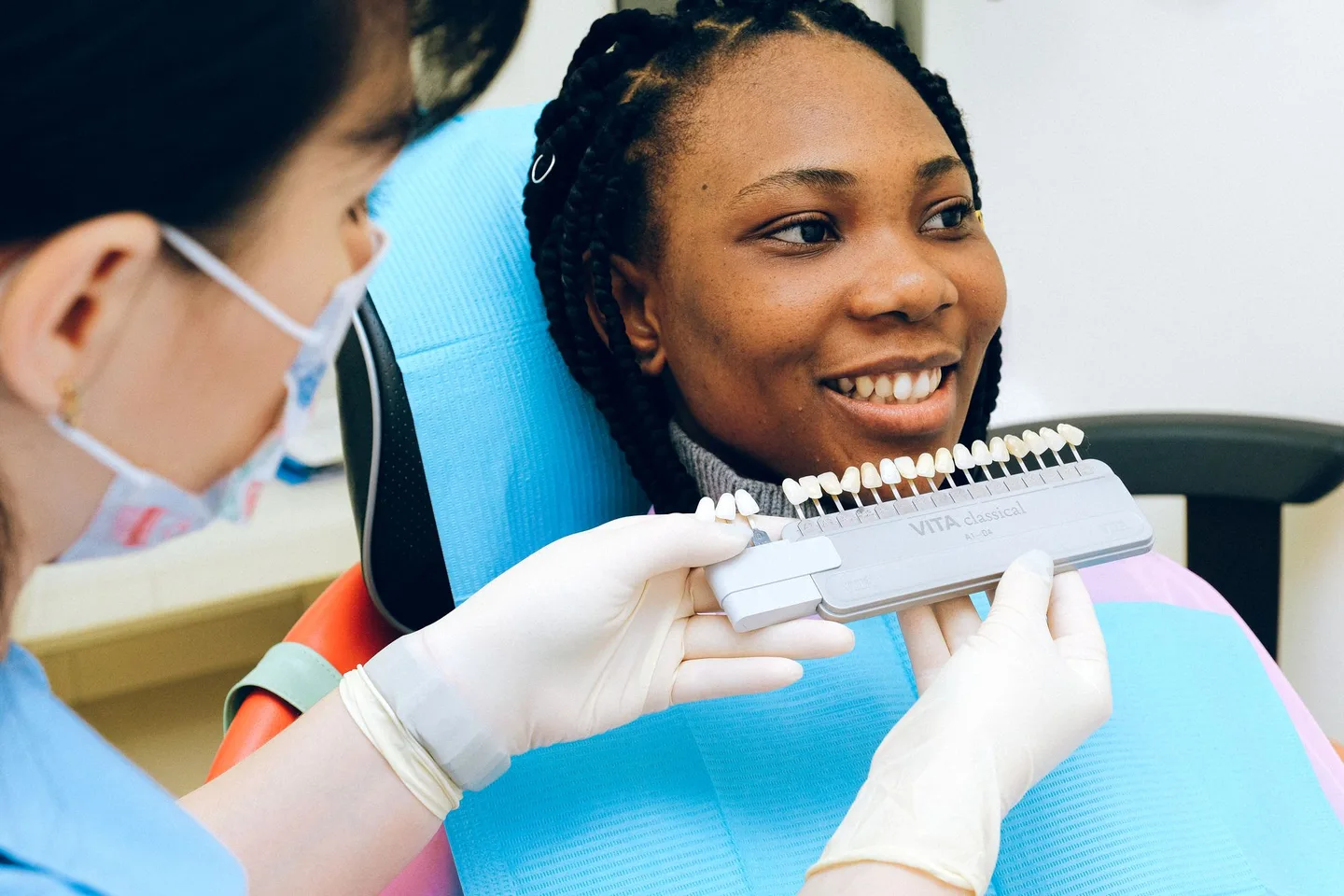
A1 and B1 are well-known references in the VITA classical A1-D4 shade system. VITA groups its tabs by hue family: A shades are described as reddish-brownish, B shades as reddish-yellowish, C shades as greyish and D shades as reddish-grey. The number within a family helps identify the shade inside that group.
This means the letter is not a cosmetic style label and the number is not a simple universal brightness score. A1 and B1 come from different hue families. A label printed on a phone screen also is not the physical tab: it is only a digital approximation affected by the photograph, display and software.
Shade names are useful for communication, but they should not be treated like paint codes that guarantee identical colour across ceramics, composites, temporary materials and image-editing tools. A physical reference and the planned restorative system must be evaluated together.
Is B1 whiter than A1? Not in every meaningful sense
B1 is commonly presented as one of the lighter-looking VITA classical choices, and it often appears less warm than A1 in photographs. Yet colour has more than one dimension. Value describes lightness, chroma describes colour intensity and hue describes the colour family. Two tabs can be similarly light while differing in warmth or saturation.
Measured colour coordinates can also vary with the reference guide, device and conditions. One published comparison of VITA classical tabs reported very similar mean lightness values for its A1 and B1 samples, while their other colour coordinates differed. That is a useful warning against turning an internet shade order into a universal clinical fact.
For a visual preview, treat B1 as a brighter, cleaner-looking comparison and A1 as a warmer comparison—not as a promise that one will always measure lighter or look better after treatment.
B1 is not automatically 'Hollywood white'
A common online shortcut equates A1 with natural white and B1 with Hollywood white. That is too simple. B1 is part of the traditional VITA classical natural-tooth shade range. Separate bleaching shade systems include options intended to represent shades lighter than the classical range.
The phrase Hollywood white has no single clinical code. Some people use it for any clearly bright smile; others mean an opaque, uniform or bleached-white result. A B1 restoration with realistic texture, translucency and tooth-to-tooth variation can look restrained. A flatter digital B1 layer with excessive brightness can look artificial.
When discussing colour, describe the visual quality you want as well as a reference code: warm or neutral, subtle or noticeable, translucent or more masking, and whether you want the smile to blend with untreated teeth or create a deliberate makeover.
How to compare A1 and B1 in a smile simulator
A fair comparison changes colour while holding the rest of the design still. If tooth length, width, position or texture changes at the same time, you will not know whether you prefer the shade or the new geometry.
Start with one unfiltered, front-facing smile photograph in soft, even light. Fit the tooth design first, choose one believable shape and save it as the baseline. Then create an A1-like warm natural version and a B1-like cleaner bright version without moving the design.
- Use the same original photo, crop and screen for both versions.
- Keep tooth shape, visible count, width, height and smile curve unchanged.
- Change warmth and brightness gently; avoid turning either version into flat white.
- Keep the same texture, translucency, edge definition and shadow settings.
- Compare close-up detail briefly, then return to normal full-face size.
- Save the original plus both concepts so the difference is easy to explain.
Which shade looks more natural in the full face?
Naturalness is a relationship, not a property stored inside one shade tab. A shade can look restrained when it repeats the warmth and contrast already present in the face, yet look too bright when the teeth become the first and only feature you notice.
Look at the eyes first and let your attention move naturally to the smile. If the teeth dominate instantly, reduce brightness or restore more surface variation. Check the transition to any untreated canines, premolars or lower teeth that remain visible. An attractive front row can still look disconnected if the side teeth create an abrupt colour boundary.
Also consider the number of restorations being discussed. A single veneer must integrate closely with its neighbours. A broader smile makeover gives more freedom to change the overall direction, but it still needs convincing variation and a sensible relationship with the lower teeth and gums.
Why A1 and B1 look different on phones, photos and social media
Phone cameras automatically alter exposure, white balance, contrast, sharpening and local brightness. Screens then apply their own colour profile and brightness. Warm indoor light can make both A1 and B1 appear more yellow, while a cool display or aggressive photo filter may make B1 look unnaturally blue-white.
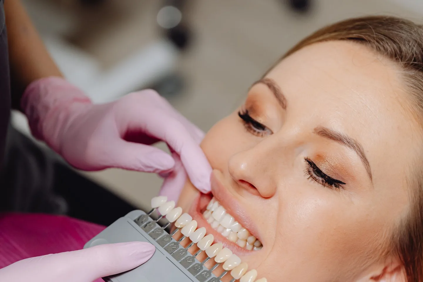
Lighting also affects professional shade selection. VITA recommends daylight conditions or standardized daylight lamps rather than ordinary room light. A recent in-vitro study found that lighting conditions changed the shade-detection accuracy of the devices it tested. A screenshot viewed on another phone is therefore not a dependable clinical colour reference.
Use online images to communicate preference, not to order a restoration by eye. Keep the original file, disable beauty filters, use one device at a consistent brightness and avoid judging shade from messaging-app thumbnails.
Why the final veneer may not look exactly like an A1 or B1 tab
A veneer is an optical stack rather than an opaque sticker. The underlying tooth colour, preparation, ceramic or composite material, translucency, thickness, surface texture and bonding material can all influence the final appearance.
Laboratory studies support this caution. Research on ultra-thin lithium-disilicate veneers found that both the veneer shade and the underlying substrate affected final shade and whiteness. Another study of translucent zirconia veneers found significant effects from ceramic thickness, cement shade and the ceramic layer evaluated.
Those studies do not predict an individual's result, and different materials behave differently. They do explain why choosing 'B1' on a screen cannot guarantee a B1-looking smile. A dentist and dental technician may use photographs, physical shade tabs, digital measurements, try-in materials or a mock-up to evaluate the complete case.
A practical clinical shade-selection checklist
Bring your simulation as a conversation aid and keep the A1/B1 labels secondary to what you actually like about each version. Ask to compare the relevant physical shade samples with your teeth and proposed material, not only with an online chart.
- Compare early, before the teeth become dehydrated during a long appointment.
- Use controlled daylight or a suitable colour-corrected light source.
- Remove strong lipstick and reduce bright surrounding colours that can influence perception.
- View the shade beside the tooth for short intervals and let the eyes rest.
- Check the whole face as well as a close-up of the tooth.
- Discuss the colour of untreated neighbouring and lower teeth.
- Ask how the planned material, translucency, thickness and tooth underneath may affect the result.
- Where appropriate, review a physical or digital mock-up before an irreversible step.
A simple decision framework
Choose the A1-like concept if you consistently prefer a warmer, quieter transition and blending is your main goal. Keep the B1-like concept if you prefer a cleaner, brighter smile and it still looks integrated at normal face size. If the choice changes every time the lighting or screen changes, you have learned something useful: the difference is too subtle for a phone image to settle.
Do not use either preview to decide whether veneers are suitable. Veneers cover the front surface of teeth and may involve irreversible removal of enamel; tooth and gum health, bite, alternatives and long-term maintenance require an individual dental assessment.
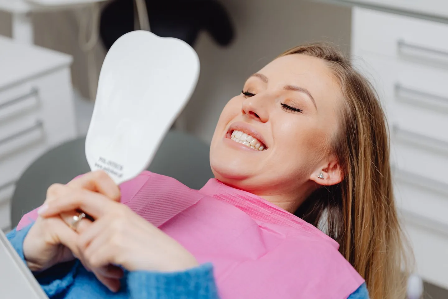
The best outcome from an A1-versus-B1 simulation is a clear sentence you can take to a consultation—for example, 'I prefer the cleaner B1 direction, but I want visible translucency and no abrupt contrast with my lower teeth.' That is more useful than arriving with one code and assuming the material will reproduce a screen exactly.
Sources and further reading
These independent clinical resources were used to check the health information in this guide.
- VITA Zahnfabrik: VITA classical A1-D4 shade guide
- VITA Zahnfabrik: Shade determination instructions and lighting guidance
- Journal of Dentistry: Impact of lighting conditions on tooth-shade selection
- BMC Oral Health: Final shade of ultra-thin CAD/CAM veneers and tooth-coloured substrates
- International Journal of Dentistry: Zirconia veneer thickness, cement shade and final colour
- MouthHealthy by the American Dental Association: Veneers
Frequently asked questions
Is B1 whiter than A1?
B1 often looks cleaner or brighter and A1 often looks warmer, but the labels belong to different hue families rather than one universal whiteness scale. Lighting, material and measurement conditions can change the comparison.
Which looks more natural, A1 or B1?
Either can look natural. A1 is often chosen for a warmer, more understated direction; B1 can still look natural when its brightness, texture and translucency integrate with the full smile.
Is B1 a Hollywood white shade?
Not automatically. B1 is part of the VITA classical natural-tooth shade range. 'Hollywood white' is an informal description, and dedicated bleaching shade systems include shades beyond the classical range.
Are B1 teeth too white?
Not necessarily. B1 may look conspicuous beside darker untreated teeth or in a flat opaque simulation, but it can look balanced when the entire smile, material and surface character are planned together.
Can I choose a veneer shade from a phone photo?
A phone photo can help communicate a broad preference. It cannot provide a reliable clinical shade match because camera processing, display colour, lighting and image compression alter the appearance.
Will an A1 veneer look exactly like an A1 shade tab?
Not always. Final colour can be affected by the restorative material, thickness, translucency, cement and the underlying tooth. The relevant material should be assessed in the context of the individual case.
Should veneers match my lower teeth?
They do not need to be identical in every case, but visible lower and untreated side teeth affect whether the smile looks integrated. Discuss the desired amount of contrast before final shade selection.
Can a smile simulator prescribe A1 or B1?
No. A simulator can compare warmer and brighter visual directions. A final shade decision requires physical or validated digital references, the intended material and professional assessment.